Responsive design and progressive enhancement are undeniably the new standards in web design. But the challenge of adapting a design for different types of media isn’t new. Every graphic designer has labored to rework a design to fit on a poster, in a brochure, on a postcard or even on a business card. The difference in the modern web environment is now a designer has to engineer an entire visual campaign into one layout while working within the constraints of html.
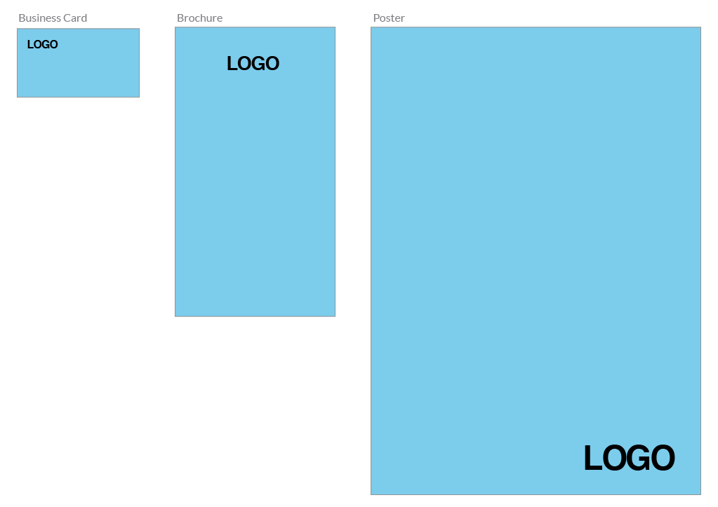
In print it’s perfectly acceptable to move elements of a design to different areas of the layout. For instance, on a business card the logo might be in the top left, on a brochure it might be at the top and centered while on the poster it might be positioned in the bottom right corner.
But on the web creating consistency in the visual language is important for several reasons. From a user experience perspective it makes the site more learnable and predicable. And keeping elements like the header, the main content and the footer in the same order across devices makes things easier for site visitors and developers as well.
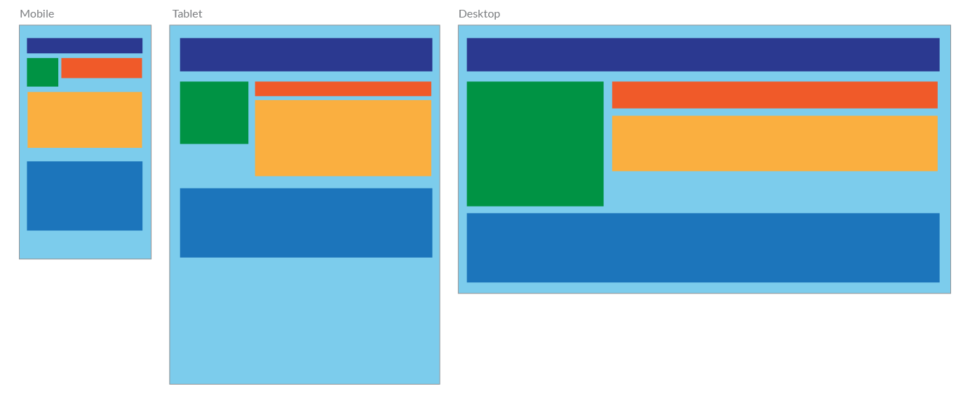
From a front-end developer perspective this makes producing the site much more straightforward. Sure, elements can be absolutely positioned using CSS and they can be reordered in the DOM via javascript. But relying on magic behind the curtain opens up more possibilities for things to go haywire when we release the site into the wild. Which leads to inconsistent behavior across browsers and increases maintenance and testing efforts.
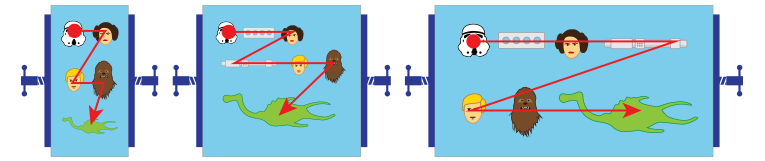
Fluid Layouts
I like to think of it as junk floating in a one dimensional trash compactor. As the walls (or container) of the compactor squeeze in, the junk floats next to each other and stacks on top of one another.
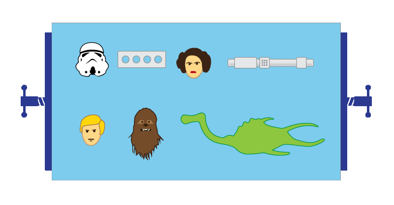
Objects can change in size and some may become hidden at smaller sizes, but since it’s one dimensional everything stays in the same sequence linearly from left to right.
Of course elements like the header, the main content and the footer within the layout can be their own “compactor” with children elements floating inside.