
Like many other Front-End Developers I’ve been using Bourbon and Neat in a lot of my projects recently. Bourbon’s mixin library and Neat’s float based grid are true time savers. However, as browser support for the flexbox layout mode increases we’re able to use it more confidently to solve age old CSS layout challenges.
I’ve found myself recreating piecemeal flexbox grids on several projects so I decided to publish a customizable, reusable library. Introducing Batch! A simple, responsive, flexbox grid system.
- Percentage Based Grid
Batch takes advantage of the flexbox layout mode. Providing vertical alignment, uniform cell height and no floats!
- Easy To Use
- Extendable Cell Sizes
Add more sizes to the
$cell-sizesmap to have thesmall-batch()mixin distill your custom cell classes. Requires Sass and Bourbon.
Download the precompiled CSS or the SCSS source file. Read the installation instructions to add Batch to your project.
The markup structure is simple and follows common grid patterns:
<div class="batch-g batch-g--gutter batch-g--padding">
  <div class="batch-c-1-3">
   Grid Cell 1
  </div>
  <div class="batch-c-1-3">
   Grid Cell 2
  </div>
  <div class="batch-c-1-3">
   Grid Cell 3
  </div>
</div>
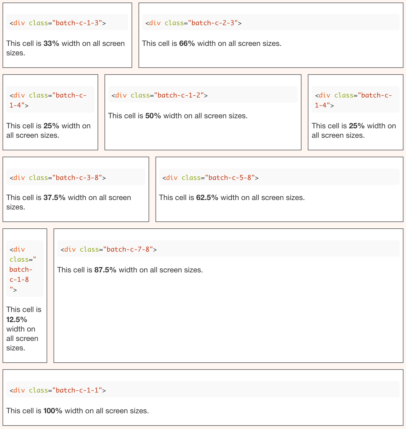
The result:
(Color added here are for illustration purposes.)

Exciting right? I know it looks like every other grid system. But by default, Batch keeps all of the cells in a row the same height:
Instead of the jagged cells below which you would normally get with floats:
And if a layout calls for uneven cell heights simply add the batch-g--valign-top class to the batch-g wrapper element:
<div class="batch-g batch-g--gutter batch-g--padding batch-g--valign-top">
  <div class="batch-c-1-3">
   Grid Cell 1
  </div>
  <div class="batch-c-1-3">
   Grid Cell 2
  </div>
  <div class="batch-c-1-3">
   Grid Cell 3
  </div>
</div>
Here’s a list of other modifier classes available:
batch-g--borderbatch-g--gutterbatch-g--paddingbatch-g--reversebatch-g--valign-topbatch-g--valign-centerbatch-g--align-bottombatch-g--align-centerbatch-g--align-right
These modifier helpers along with all of the responsive classes are demonstrated on the Batch docs page. The responsive classes follow the naming convention used in other popular grid systems like PureGrid, Bootstrap and csswizardry-grids.
Example responsive markup structure:
<div class="batch-g">
  <div class="batch-c-1-1 batch-c-md-1-2 batch-c-lg-1-4">
   ...
  </div>
  <div class="batch-c-1-1 batch-c-md-1-2 batch-c-lg-1-4">
   ...
  </div>
  <div class="batch-c-1-1 batch-c-md-1-2 batch-c-lg-1-4">
   ...
  </div>
  <div class="batch-c-1-1 batch-c-md-1-2 batch-c-lg-1-4">
   ...
  </div>
</div>
In the above markup the cells will be 100% width on mobile size screens, 50% width on tablet size screens and 25% width on desktop size screens. View Example. If you’re using Bitters’ grid settings in your project, import the Batch SCSS source file last in your main manifest and it will adopt the breakpoint sizes defined in the Bitters _grid-settings.scss file.
// Import Bourbon
@import "bourbon";
// Import Bitters
@import "base/base";
// Import Neat
@import "neat";
// Import Batch
@import "_batch.scss";
The breakpoints settings in Batch use the Sass !default flag so the variable will not be re-assigned when Bitters is imported first.
// Breakpoints un less already defined when using Bitters
$medium-screen: em(640) !default;
$large-screen: em(860) !default;
The gutter size, padding size, border width and border color can be customized by changing the Sass variables:
// Cell Gutter
// Must be an even number
$batch-gutter: 10px;

// Cell Padding
$batch-padding: 5px;

// Cell Border
$batch-border: 1px;

// Cell Border Color
$batch-border-color: #666666;
You can also create your own cell sizes by adding to the $cell-sizes Sass map in the SCSS source file.
// Default sizes are 3rds, 4ths, 6ths, 8ths, 12ths and 24ths:
// 1-1, 1-2, 1-3, 1-4, 1-6, 1-8, 1-12, 1-24
// 2-3
// 3-4, 3-8
// 5-6, 5-8, 5-12, 5-24
// 7-8, 7-12, 7-24
// 11-12, 11-24
// 13-24
// 17-24
// 19-24
// 23-24

$cell-sizes : (
  1   :  (1, 2, 3, 4, 6, 8, 12, 24),
  2   :  (3),
  3   :  (4, 8),
  5   :  (6, 8, 12, 24),
  7   :  (8, 12, 24),
  11  :  (12, 24),
  13  :  (24),
  17  :  (24),
  19  :  (24),
  23  :  (24)
);
The key is the numerator and then the small-batch() mixin loops through the value array for each denominator. The key-value pair is used in the class name and is also used to calculate the width percentage. Additionally you can remove sizes from the list that you don’t need in your project to lighten up the compiled CSS file.
@mixin small-batch($breakpoint:'') {
  @each $key, $cell-size in $cell-sizes {
    @for $i from 1 to (length($cell-size)+1) {
      $cell-size-percentage: (percentage($key/nth($cell-size, $i)));
      .batch-c#{$breakpoint}-#{$key}-#{nth($cell-size, $i)} {
        @include flex(0 0 auto);
        width:$cell-size-percentage;
        .batch-g--gutter > & {
          width:calc(#{$cell-size-percentage} - #{$batch-gutter});
          margin: ($batch-gutter/2);
        }
      }
    }
  }
}
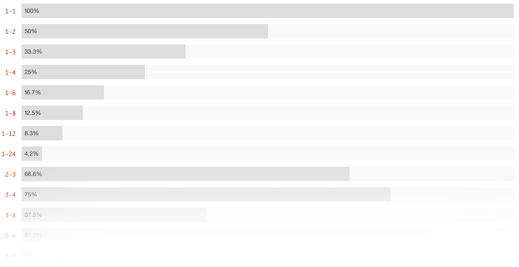
Below is an example of the resulting class widths:
This is just release 1.0.0 so any feedback, suggestions or comments are welcome. Feel free to fork the GitHub repo and submit a Pull request. I hope Batch saves you some time and helps streamline your projects too!